
Remove to Improve: The Data-Ink Ratio Edition
Joey Cherdarchuk
Aug 20, 2013

Edward Tufte introduced the concept of data-ink in his 1983 classic The Visual Display of Quantitative Information. In it he states "Data-ink is the non-erasable core of the graphic, the non-redundant ink arranged in response to variation in the numbers represented" (emphasis mine). Tufte asserts that in displaying data we should remove all non-data-ink and redundant data-ink, within reason, to increase the data-ink-ratio and create a sound graphical design. Stephen Few convincingly argues that some redundancy is often more effective and we agree, however, most graphics don't struggle with understatement. In fact, most contain a stunning amount of excess ink (or pixels). Rather than dressing our data up we should be stripping it down.
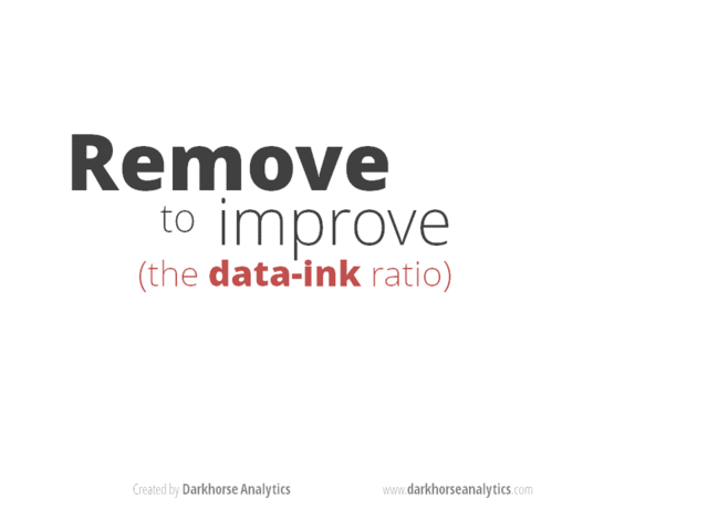
To illustrate how less ink is more effective, attractive and impactive we put together this animated gif. In it we start with a chart, similar to what we've seen in many presentations, and vastly improve it with progressive deletions and no additions.
The next time you are trying to improve a chart, consider what you can take away rather than what you can add.
“Perfection is achieved not when there is nothing more to add, but when there is nothing left to take away” – Antoine de Saint-Exupery
