Data Looks Better Naked

Data Looks Better Naked

Remove to Improve Series: Maps Edition

Joey Cherdarchuk

Aug 19, 2016

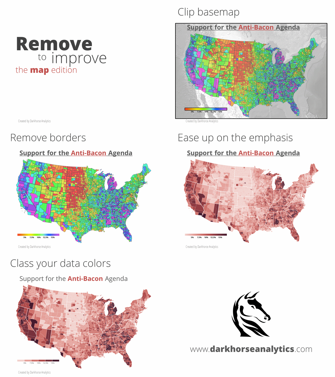
We've explored improving our bar chartsdata tables, and pie charts – all with the maxim: remove to improve. In this new installment of our Data Looks Better Naked series, we take on maps. More specifically, the choropleth map.

There are libraries with entire floors devoted to the art and science of cartography so, clearly, this animation is general advice for one specific type of map. When your rate or ratio data is for geographic areas (like counties) and the spatial relationship of the data is what you want to emphasize, then the choropleth could be the right choice for you. But how do you ensure your data stays in the forefront and your chart remains attractive? Let’s have a look.

map_reduce2.gif


Classing your data may be the most controversial advice in the animation. In our office we still like to argue over the aesthetic and functional merits of this technique whenever we're putting together a choropleth. Classing is not always the best choice, particularly if subtle shifts in the overall geographic pattern are important. However, if your chart is going into a static report and you want people to read the values from the map, then get classy.

For some more detailed description about choropleths and discussion about classed vs unclassed maps, check out this article on indiemapper and for an excellent primer on the impact of different classing methods see John Nelson's excellent post on Telling the Truth with your classes.

LOVE DATA AS MUCH AS WE DO?

Join our readers who get design tips, visualization stories, and clarity straight from Darkhorse.

10139 81 Avenue NW
Edmonton, AB T6E 1W9
Canada

1-800-261-1832

Empower Your Research.


Amplify Your Insights.


Impact Your Mission.

© Darkhorse Visualization 2026 · All Rights Reserved

10139 81 Avenue NW
Edmonton, AB T6E 1W9
Canada

1-800-261-1832

Empower Your Research.


Amplify Your Insights.


Impact Your Mission.

© Darkhorse Visualization 2026 · All Rights Reserved

10139 81 Avenue NW
Edmonton, AB T6E 1W9
Canada

1-800-261-1832

Empower Your Research.


Amplify Your Insights.


Impact Your Mission.

© Darkhorse Visualization 2026 · All Rights Reserved

10139 81 Avenue NW
Edmonton, AB T6E 1W9
Canada

1-800-261-1832

Empower Your Research.


Amplify Your Insights.


Impact Your Mission.

© Darkhorse Visualization 2026 · All Rights Reserved