Joey Cherdarchuk
Jan 15, 2013


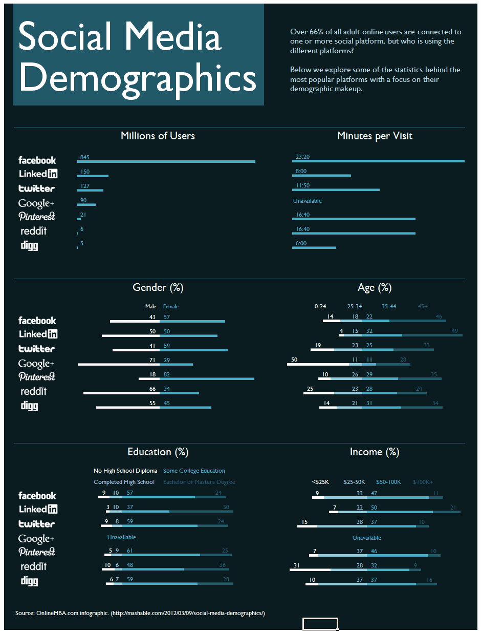
I’m currently going through Alberto Cairo’s online visualization course and our first exercise was to assess the merits and shortcomings of selected infographics. One graphic was in the now ubiquitous long vertical format image designed to attract traffic to an unrelated site; in this case to an online education sales portal. This is not a rant about these marketing efforts which place style over substance, but rather an opportunity to explore an underused graphic form.
This overdesigned infographic’s most grievous sin is that it prevents what Edward Tufte refers to as “the first grand principle of analytical design: above all else, always show comparisons.” The data to be compared is there of course, it is just that it is provided in a manner that obscures, rather facilitates, comparison. Let’s look at age for instance. Here are the data from the graphic spread across 4-8 screens depending on your monitor resolution.
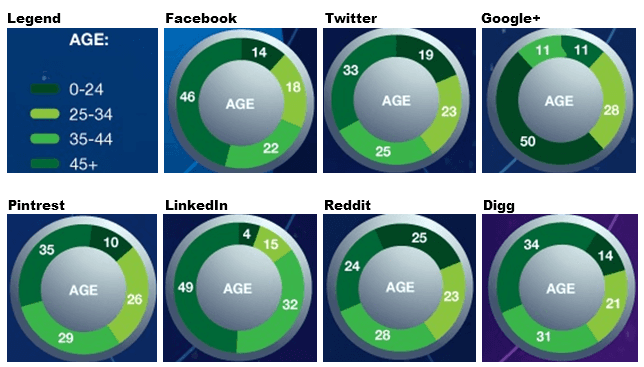
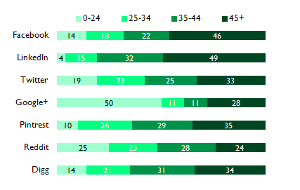
Just putting them side by side is a considerable improvement, but of course they are in donut charts and even when they are “galactic, orbiting, satellite donut charts” they still suffer from the same drawbacks as pie charts. Let’s unfurl and straighten those donuts.
Ahh, much better, but I think we can take it a step further to ease our cognitive load when looking for insights. This is where we pull out our underused graphic form. It is actually still a stacked bar chart, just adjusted to better suit these purposes. The current stacked bar encodes its data using length, but now we will also use the position of bars to give us a picture of the ages. Instead of aligning the start of the bars, let’s align things from the centre. Basically we’ll make where 25-34 meets 35-44 our baseline and have over 35 (2 stacks) go out to the right and under 35 (the 2 remaining stacks) go out to the left.
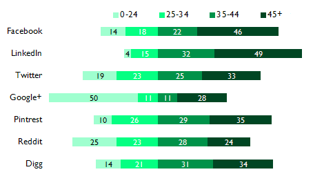
We’ve made it slightly harder to compare 0-24 among the platforms because they no longer have a common baseline, but in since we’ve given the next category a common baseline we’ve made it much easier to compare 25-34 as well as the combination resulting in 0-34. On the right side we’ve made it harder to compare 45+, but improved 35-44 and 35+. It is easy to see at a glance which skews youngest, because it is the furthest to the left. Likewise, the oldest skewed is also the bar furthest to the right.
Naomi Robbins calls this a diverging stacked bar and it is incredibly useful for survey data. You can read more about it here and here. What’s interesting is the chart form is not new. Willard Brinton provided the example below in his 1939 book Graphic Presentation.
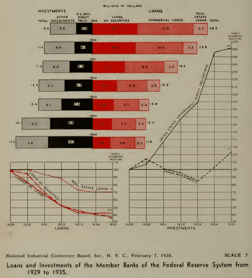
The chart makes clear the shift away from Loans and toward Investments without sacrificing the ability to see the breakdown among those categories. Whenever you’re using a stacked bar with related categories, consider whether moving the baseline to the middle might make the information even easier to process.
So back to our infographic. Now that we know this form works for us, we can apply it to the other demographic data sets. When we wrap the whole thing we get a much more compact and informative package.