Salvaging the Pie

Salvaging the Pie

Remove to Improve Series: The Pie Chart Edition

Joey Cherdarchuk

Sep 26, 2014

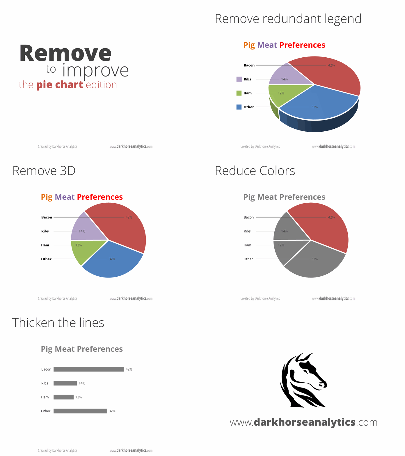
The poor, maligned 3D pie chart. He is so popular among the common folk, but put him next to his peers and his vacant stare betrays (not entirely unfounded) feelings of insecurity and inadequacy. Sometimes the only way to address such feelings is to let go of your inhibitions and do something unexpected. He has value hidden away, we're sure of it. And so, for the third installment in our Data Looks Better Naked series, we are recommending that the 3D pie do what the bar chart and table have done before him: start stripping to see what he might be concealing.

Devour the Pie


Devour the Pie

There are a ton of articles out there explaining the disadvantages of pie charts, which is why they rarely turn up in our work. My good friend, Dan, is fond of saying, "You have three pie charts to use in your lifetime, so choose them wisely," however this article by Bruce Gabrielle makes some decent counterpoints worth considering (except the second point, pie charts are terrible at trends.) So if you've got a pie chart, consider if something else wouldn't be a better solution. Or you could just embrace it.


LOVE DATA AS MUCH AS WE DO?

Join our readers who get design tips, visualization stories, and clarity straight from Darkhorse.

10139 81 Avenue NW
Edmonton, AB T6E 1W9
Canada

1-800-261-1832

Empower Your Research.


Amplify Your Insights.


Impact Your Mission.

© Darkhorse Visualization 2026 · All Rights Reserved

10139 81 Avenue NW
Edmonton, AB T6E 1W9
Canada

1-800-261-1832

Empower Your Research.


Amplify Your Insights.


Impact Your Mission.

© Darkhorse Visualization 2026 · All Rights Reserved

10139 81 Avenue NW
Edmonton, AB T6E 1W9
Canada

1-800-261-1832

Empower Your Research.


Amplify Your Insights.


Impact Your Mission.

© Darkhorse Visualization 2026 · All Rights Reserved

10139 81 Avenue NW
Edmonton, AB T6E 1W9
Canada

1-800-261-1832

Empower Your Research.


Amplify Your Insights.


Impact Your Mission.

© Darkhorse Visualization 2026 · All Rights Reserved