
How to be More Effective
Daniel Haight
Jan 9, 2020

In that last post, we introduced the concept of The Visualization Frontier. It’s a simple rubric to measure the effectiveness of your data visualization. We defined effectiveness as the combination of clarity and engagement.
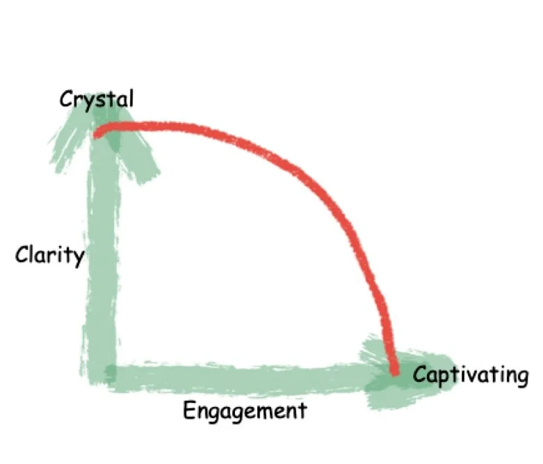
The closer you are to the red line, the more effective you are. (We hinted the red line may differ by skill level.) In any case, you want to improve. How?
Ask the Right Questions
Let’s assume you have some data to visualize. Are you aiming more towards clarity or engagement? Here are some questions you can ask yourself:
Who is your target audience?
What is the main thing you’re trying to say?
What do you want your audience to do about it?
Try to be as specific as possible as you explore these questions. It might even help to build them into a use case or user story. The process is almost identical to the steps you’d take if you were designing software.
Things that are more decision-oriented will lean toward clarity. If you’re trying to delight people, then it’s more about engagement.
For example, if you’re building a dashboard for an air traffic control center, then you want to be five-star clarity--your audience is already super-engaged. If you want to get a million new Facebook friends, then you need five-star engagement--clarity is secondary.
Visualize the Signal
Separating signal from noise is the essence of clarity—and where you start. Don’t jump to a cool concept until you’ve locked onto the signal. It drives chart choice, layout, and interaction. Many projects fail here because the data can’t support the concept. Great data visualizers are great signal finders—analysts at heart.
Think back to the suicide graphic in the previous article. The creators likely explored a wide data set and discovered age cohort was the strongest signal, then chose a visual that foregrounded it. Signal comes first, even if your aim is engagement.
Improve the Engagement
Here are four ways:
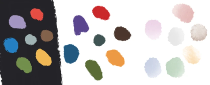
Colour to set the tone. Choose a palette that fits the purpose; don’t overdo it. Grey is your friend for context.
Animate with purpose. Animation is the ghost pepper in your visual toolbox. Too much is deadly. If you overuse it, it’ll catch your eye like those little hooks on old bathroom stall doors. Nobody wants that. Instead, animate to ease your user into the visual or lead them through a narrative.
Go ahead and introduce elements of your visualization sequentially. Users will be able to understand a richer, denser visual that way. Simulate the passing of time by animating your bars or lines on a chart. Peel back contextual items one by one to reveal the signal. Don’t animate willy-nilly. Use it to deepen engagement by fostering understanding.
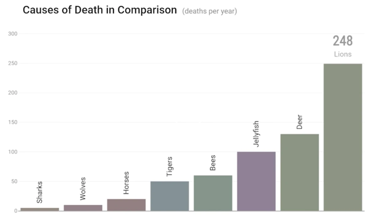
In keeping with our rather morbid theme, I present a simple, yet very effective animation of Selected Causes of Death. By applying animation to a simple bar chart, the authors have turned a boring column chart into a compelling story:
Narrate to connect. Speaking of stories, humans spent millennia spinning them around campfires. Narratives are so hard-wired into our brains that we’ll create them even when they’re not appropriate. Use this to your advantage.

Introduce some of the insights in your data through a story - whether text or video or animation. Lead your user through your visual to both introduce functionality and to demonstrate the possibilities. These narratives become on-ramps to complex visualizations. They help users cross that great chasm between passive consumption and active exploration.
Don’t underestimate how difficult this crossing can be. Only a fraction of your users will do anything more than scroll.
Interact to discover. If you’ve done well on colour, animation, and narrative, then your users may actually entrust you with their full attention. They’re no longer passive consumers, but active participants.
Don’t abuse this trust with frivolous controls.
Have a laser-like focus on the purpose you defined above. You’ll be tempted to let your users change the fonts and the colour palette and the chart type (“because some users might want to!”). No you don’t - you’re not building Tableau. Giving users “the option” confuses them more times than not.
Instead, channel your inner Steve Jobs: what’s the fewest number of choices you can offer (while still fostering a sense of ownership)? What’s the least amount of interaction that still allows discovery?
You want a sandbox with walls that make it difficult to get lost or self-deceived, but big enough to own the results. Once again, think back to that suicide visual. It had very little interaction, but it was enough to discover the signal.
This is an incredibly difficult balance. Your design choices here are what will set you apart. How much context, how much comparison, and how much drill-down is needed for the decision at hand? Mock it up and then pare it down.
Have new users play with it and see where they get lost. Keep revisiting your purpose and the signal you’re trying to reveal. You’ll know you’ve arrived when your testers figure it out without a tutorial.
That last five per cent
When your house is built and painted, you’ll feel like you’re almost there. Unfortunately, half the work is still to come. Finishing carpentry is a huge time burner.
Similarly, your “feature-complete prototype” is a long way from prime time. The polish can take forever. Push your project toward greater clarity and engagement. Get others to rate your work on these dimensions. Then, bare down for that last five per cent to the frontier.
In the end, great visualizations are far more difficult to create than they appear. But the extra time and attention is what separates the memorable from the filler.
More From the Blog

