
Joey Cherdarchuk
Dec 22, 2014

We've done a few critique/redesigns of graphics on the site, but now its time to shine that sometimes unflattering light back on ourselves. While going through some materials I came across a graphic much like this one.
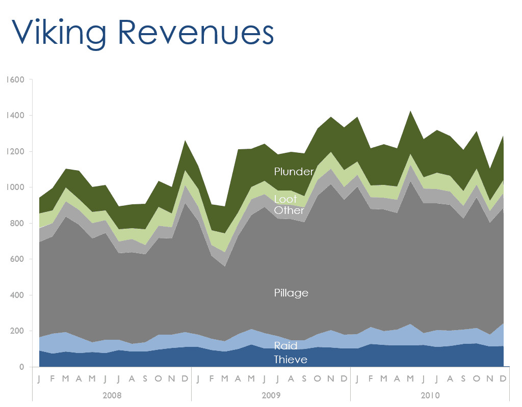
The chart is clean, with axes lightened so the data is in the foreground, and the series direct labelled. Unfortunately it is not very effective at conveying much beyond "There is lots of pillaging." If we look closely we may also see a slight upward trend in Thieving and in revenues overall, but insights beyond that are all obscured by our chart choice.
The problem with stacked charts is that only the first series, in this case Thieving, and the total of all series are clearly displayed. Everything else is distorted by the shifting baseline of the series beneath it. If you want to note patterns in the individual series, stacked charts are inadequate.
Don't be afraid of small things The solution in this case is to simply make a small chart for each series. Often called "small multiples" these charts reveal the patterns for each series and let us compare between the series. To give a sense of the proportions of the different series we can add another chart specifically for that purpose. What pops out now is a rather interesting change in Plundering which was previously hidden.
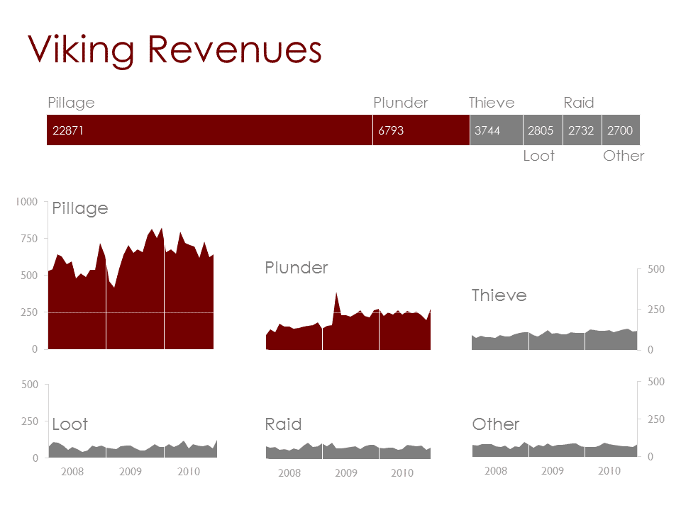
Don't be afraid to make your charts smaller to communicate a bigger, more complete message.
