Why Most Visualizations Fail and What to Do About It
Daniel Haight
Dec 9, 2025
You built a powerful data visualization. The launch went well. Press coverage, social shares, a respectable traffic spike. By month four, the numbers are cratering. By year two, you're the only one who remembers it exists.
This is the default trajectory. Not because your work lacked rigor or your design lacked polish. Because the architecture was wrong.
But some tools break this pattern. They don't rely on novelty or hope. They follow a structure that guides users from curiosity to conviction to action.
We call it the Data Hero Framework.
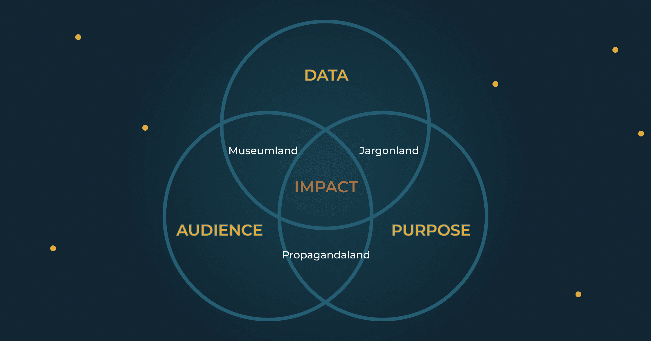
Two Problems, One Architecture
The typical visualization suffers from two distinct failure modes.
Problem One: Nobody Interacts. You built something meant to be explored. They visit and promptly leave. The analytics show pageviews but no clicks, no zooms, no discovery. Your interactive map is treated like a static image. Users are trained to scroll mindlessly through content, and your visualization is just more content to scroll past.
Problem Two: Nobody Returns. The launch week spike is followed by a surprisingly steep decline. Six months later, you're the only one who remembers it exists. There's no mechanism for organic growth, no way for the tool to spread beyond your initial push. Dead end.
Research on viral content suggests why this is the default. A 2025 study analyzing over 1,000 news outlets found that most viral moments "do not significantly increase engagement and rarely lead to sustained growth." In about half of cases, the impact fades within the first week or never materializes at all. The launch spike is a sugar high. Without architecture that converts attention into advocacy, decay is inevitable.
Both problems have the same root cause: the visualization is an endpoint rather than an infrastructure. It asks users to do the work of engagement without earning their attention first. And it provides no pathway for that engagement to multiply.
The Discovery
We learned this the hard way.
About a decade ago, we entered a data visualization competition. We won in two categories. In one, we visualized high school grades by subject and school across the province. In the other, we visualized every baby name registered in Alberta for thirty years.
Both projects appealed to the same audience: parents wanting the best for their children. Both were technically excellent. Both allowed rich exploration of complex datasets.
The school grades project launched as a pure interactive. Users landed on a tool and were immediately invited to explore. It was a room full of answers with no sign on the door. Traffic was minimal. People scrolled past. The few who did engage rarely returned.
The baby names project opened differently. It began with a slideshow. You'd see the rise of "Jennifer" in the 1970s. The brief dominance of "Brittany" in the late 1980s. The mysterious ascent of "Liam." (Nobody knows why Liam. Liam just happened.) Cultural shifts made visible through the names parents chose. Only after this curated journey did the tool invite you to "explore the data yourself."
The result: far more traffic, hundreds of backlinks, and still generating views ten years later.
Same competition. Same audience. Same execution quality. The difference? We told a story first.
The story gave users context and curiosity. It proved the data's relevance before demanding their effort. By the time they reached the interactive, they were already invested. They wanted to find their own insights.
The Framework
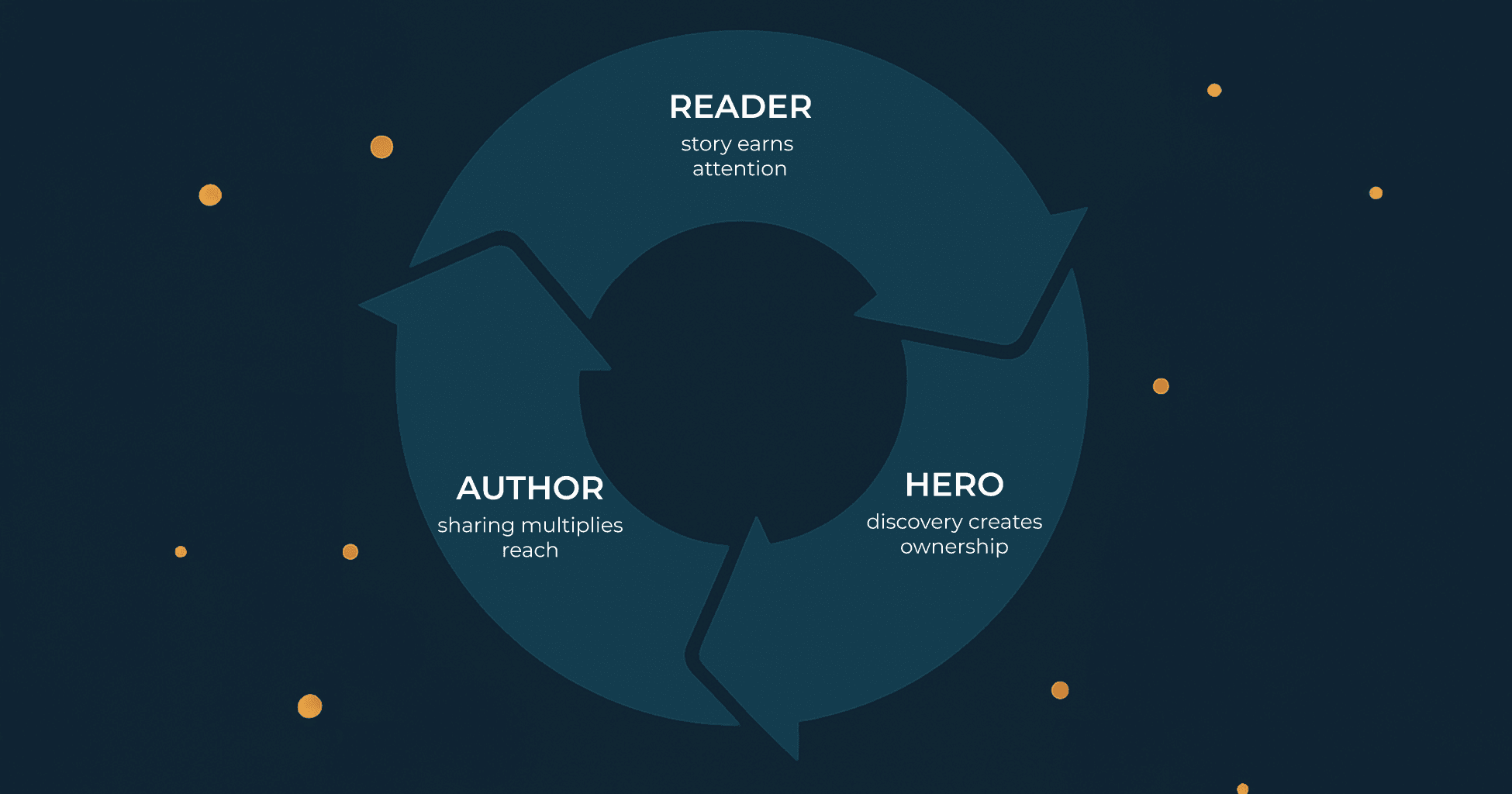
The pattern that emerged has three stages.
Stage One: The Reader
A well-told data story connects to our neural wiring for narrative. It makes complex findings intuitive and memorable. It's a curated journey that says: follow me, and I will show you something important.
The Reader stage earns trust before demanding effort. It says: this data contains something worth your time. (Imagine a first date that opens with an unsolicited explanation of cryptocurrency. That's what interaction-first design feels like to users.)
Stephanie Evergreen puts it simply: we can process three to five chunks of information, and that drops even lower when we're stressed or busy. Story-first design delivers cognitive chunks in sequence. It lowers the barrier to deeper engagement.
The Reader stage isn't decoration. It determines whether anyone reaches the interactive at all.
Stage Two: The Hero
After the story primes curiosity, the Hero stage invites discovery. This is the interactive space, the sandbox, where users explore the data for themselves.
This stage fails alone because people are trained to scroll, not click. Without curiosity sparked by a story, the cognitive hurdle is too high. Users see an interactive and think "work." They keep scrolling.
The magic is in the handoff. Story does the heavy lifting. Then a well-placed "see for yourself" converts attention into agency. The user stops reading and starts discovering.
There's a reason this works. When you discover an insight yourself, you don't just remember it better. You understand it differently. The insight becomes both truth and ownership.
The Reader tells them what's important. The Hero lets them discover why it matters to them personally.
Stage Three: The Author
This is the stage most teams miss entirely.
Years after that competition, we noticed something about the baby names tool. It wasn't just that people engaged. They shared. Bloggers embedded it. Parents posted their findings. Other sites linked to it. The tool grew not because we promoted it, but because users turned their discoveries into their own content.
That's when we recognized the third stage: where private insight becomes public story. Without it, a tool is a dead end. With it, a tool becomes a flywheel.
Now we design for it deliberately. Different users need different sharing mechanisms.
Consider the Opportunity Atlas, which we built with Harvard's Opportunity Insights team. The tool visualizes economic mobility for every neighborhood in America. Different users need different pathways to authorship.
Journalists need embeddable maps with deep links that preserve their specific view. Policy advocates need exportable images with built-in citations for slide decks. Local advocates need tract-level PDF reports they can print and bring to city council. (Council members are not going to visit your website. They will look at a piece of paper someone hands them.) Researchers need downloadable data with methodology documentation for their own analysis.
Each sharing mechanism creates a new entry point. The journalist's embedded map appears in an article read by thousands. The policy advocate's slide shows up in a budget hearing. The local advocate's PDF gets passed around a neighborhood association meeting.
Each shared artifact becomes a new hook that pulls in new readers.
This is the flywheel: Reader, Hero, Author, Reader.
Each shared story pulls in new users, who discover their own insights, and author their own stories. The tool stops being a destination you have to promote and starts being an ecosystem that grows on its own.
The Proof
When these three stages work together, a tool becomes self-perpetuating.
The Opportunity Atlas launched in 2018. Seven years later, it still generates TikTok videos from users discovering their childhood neighborhood's mobility data. The underlying research has been cited in over 219 policy documents. It attracts 14,000 visitors monthly without active promotion.
It shows up in policy briefs and council packets not because we put it there, but because users did.
This is what separates a tool that changes decisions from a tool that gathers dust. The Opportunity Atlas didn't succeed because it had better data (though it did). It didn't succeed because it had prettier design (though it does). It succeeded because its architecture invited engagement, enabled discovery, and facilitated sharing in ways that created compounding reach.
Compare this to the typical trajectory: a launch spike from press coverage, followed by steady decline as novelty fades and promotion budgets exhaust. By month six, traffic is a fraction of launch week. By year two, a rounding error.
The difference isn't effort or budget. It's architecture.
What Your Research Deserves
Most visualizations follow the default trajectory: spike, decline, forgotten. This isn't a failure of curiosity or quality. It's a failure of architecture.
The framework reclaims the oldest pattern of human communication: stories that are heard, lived, and retold. The Reader stage earns attention. The Hero stage enables discovery. The Author stage multiplies reach.
Your research took three years and two million dollars. The difference between a spike and a flywheel isn't effort. It's structure.
If you're planning a launch and wondering whether your tool has the bones to sustain itself, we should talk.
More From the Blog