Why your research is dying in silence (and what actually works)
Daniel Haight
Dec 9, 2025
When I was a wee lad, my parents began attending a church with cult-like tendencies. High-powered preachers in tailored suits would talk for what seemed like hours. One had a pin-striped burgundy suit and vest which made him look remarkably like Al Capone. Another was proud of his snakeskin boots. Putting the devil where he belonged. A third drove a Jaguar that he parked, conspicuously, in the fire lane. (The Lord provides.)
One Sunday, a particularly charismatic preacher was getting into his rhythm. Too caught up, maybe, in the sound of his own voice. He began to stray toward heresy. I don't remember the specifics. Something about prosperity and faith and causation running in the wrong direction.
A man in the pews had the temerity to question him. A mumbled "that's not true" or "that doesn't make sense." The preacher faltered. The crowd perked up, their trance broken.
"What did you say?"
The man repeated his disagreement. Everyone gasped.
"Ushers, remove this man."
He was escorted out and the preacher finished his sermon. Nobody else interrupted. We never saw the man again. I remember my parents discussing it on the drive home. They thought the preacher had overreacted, but also that the man should have known better. You don't question the pulpit.
I think about that scene more than I probably should. The elevation of the speaker. The silence of the pews. The fate of the one person who tried to engage rather than receive.
Because most research communication is built for the same architecture.
Fourteen percent of research makes it into practice. The other eighty-six percent is cited, celebrated, and ignored. If you're part of the lucky fourteen per cent, you'll still wait an average of seventeen years for it to actually affect the world.
Seventeen years. That's longer than many academic careers. Long enough for the graduate student who ran the analysis to become the department chair who ignores it.
These numbers come from medicine, where they track such things. In policy research, we don't measure as carefully. Probably for the best.
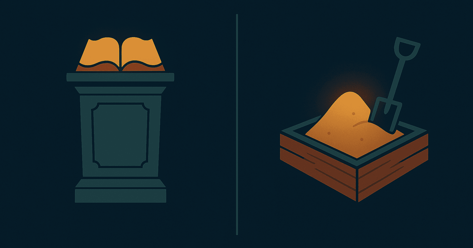
Press release, PDF, conference keynote. One message, broadcast outward. If it doesn't land, preach again, louder this time.
Here's what's changed: you can no longer borrow trust.
The intermediaries who once translated research for broader audiences have either lost credibility or lost funding. Your local paper laid off its statehouse reporter in 2014. Nobody's finding your local angle for you.
"Studies show" has become a punchline. Eggs went from staple to poison to superfood in a single generation. Butter made the same journey. I think coffee is good for you this week, but don't quote me. The average person has watched this carnival long enough to conclude that experts are either confused or lying.
The pulpit worked when the congregation believed in preachers. Sometime in the last twenty years, that stopped being true. The replication crisis didn't help. Neither did the parade of experts confidently wrong about things that mattered.
So how do people actually make high-stakes decisions now?
Some defer to experts anyway. Consultants, academics, credentialed authorities. "McKinsey says." "Harvard found." This is the pulpit model. Still works sometimes, but the hit rate is declining.
Some do their own research. Either primary research, like a scientist, or the more common version: cobbling together sources that trigger their trust sensors and triangulating. This takes time. Most decision-makers don't have three years to validate a decision that needs to happen this quarter.
And some play with a tool. They run simulations, what-if models. Spaces where they can poke at the assumptions themselves.
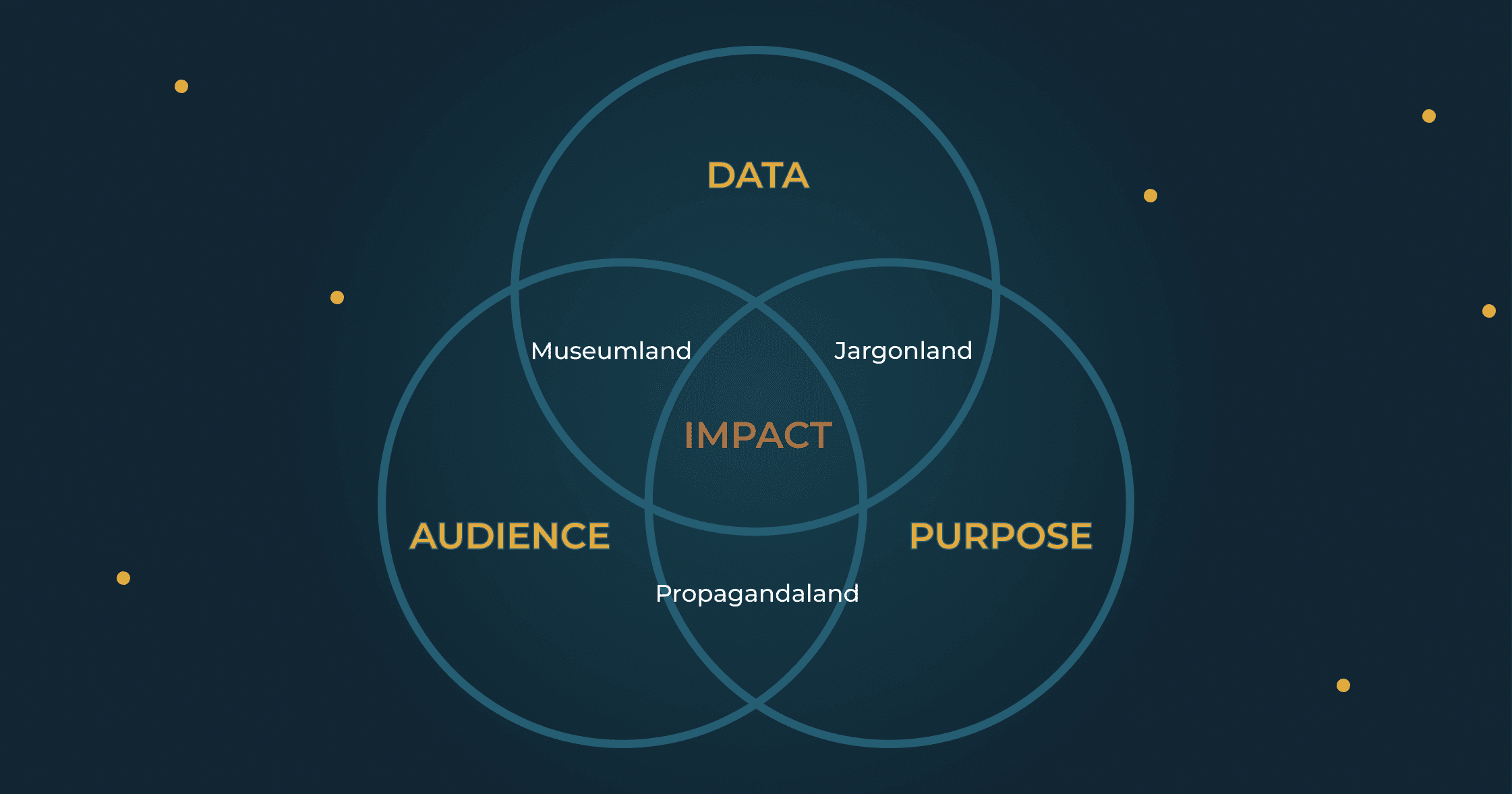
This third option barely existed before the 90s. We call it a decision sandbox.
A decision sandbox is not a dashboard. Dashboards show you what happened. They're portraits, useful but static. A sandbox lets you ask "what if?" and get an answer. That difference matters more than it sounds.
A decision sandbox doesn't preach findings. It creates conditions for someone to discover them.
Every audience confronts research with two questions. They won't articulate them. They might not even know they're asking. But their willingness to act depends on how you answer.
Can I trust it? They understand you perfectly. They just don't believe you. They've been burned before. Maybe by research that turned out to be advocacy in a lab coat. Maybe by their doctor telling them to avoid eggs. You used to clear this hurdle by borrowing credibility from your institution, your journal, your funder. That path is narrowing.
Can I make it mine? They understand. They believe. They don't care. We've all done it: delivered a national finding when they needed their county, a policy implication when they needed a headline, a methodology section when they needed something they could use on Tuesday.
The pulpit forces you to pick one answer, for one audience, and hope.
The decision sandbox, when it works, answers both.
Fifteen years ago, I built a tool that predicted teacher shortages. County by county, ten years out. The model was textbook demography: cohort components, retirement curves, birth rates, migration. The kind of methodology that makes academics nod approvingly and ministry officials check their phones.
After a short presentation, I handed the mouse over to the director who'd sponsored the project. I expected her to go straight to the bottom line. How many teachers would they need to hire over the next five years?
That's not what happened. She spent her first ten minutes exploring everywhere but the provincial summary. She found the oil patch counties and watched families arrive during booms, then vanish when prices crashed. She checked the college towns and spotted the predictable spike of eighteen-year-olds every spring, most of them gone by twenty-one. She traced how new teachers had to find their first jobs in the far north, and then like clockwork, move back to the cities after receiving their permanent certificate. She clicked on the rural counties and noticed how outmigration was suppressed during recessions, releasing pent-up waves when the economy recovered.
Each county had its own vagaries. Each one told a small story that made sense against what she already knew about the province.
Only after exhausting these small validations did she look at the overall forecast. By then, something had shifted. She wasn't skeptical anymore. When the tool showed the scale of investment the government would need to make, she was ready to believe it.
This is the two-stage process. First, she tested the model against things she already knew: oil towns boom and bust, college towns spike with freshmen, rural flight accelerates in good times. The model passed. Can I trust it? Yes.
Then she explored the implications for her own context, discovering insights that became hers. Can I make it mine? Already done.
Later, we heard that some school districts were using the forecast in their hiring decisions, trusting it more than the principal's own intuition about enrollment. As a recovering consultant, I can tell you this almost never happens. When bureaucrats hand operators a recommendation, it's almost universally ignored. Too abstract. Too disconnected from ground truth. Too much "McKinsey says."
But a decision sandbox that lets you test the model against what you already know? A well-built sandbox overrides intuition. Not by arguing with it, but by earning enough trust that intuition defers.
When the director found that oil towns boom and bust, that insight was hers. Not because I told her. Because she found it.
I think this works because a decision sandbox compresses the research process itself. Researchers spend months or years collecting data, testing hypotheses, discovering patterns, building conviction through repeated validation. That journey is what makes findings feel true to the people who did the work. Everyone else just gets the conclusion.
A decision sandbox recreates that journey in miniature. The same process of testing, discovering, validating. Compressed from months into minutes. The user doesn't just receive a finding. They arrive at it.
More From the Blog