Daniel Haight
Dec 9, 2025
The conference room smelled like hockey tape and disappointment.
Our models were sophisticated. Our charts were beautiful. But the head scout just squinted at the screen and asked, "What the hell is R²?" Another, arms crossed, asked if we'd ever actually played hockey.
We hadn't failed on the data. We'd failed on the translation. We were speaking regression coefficients to people who spoke goals and grit.
You know this room. Maybe it doesn't smell like hockey tape, but you've felt the same silence when a policymaker's eyes glaze over your model, or when a congressional staffer abandons your tool mid-explanation. Your brilliant research, met with a wall of polite incomprehension.
The problem is rarely your analysis. It's that your visualization has wandered into one of three dead ends.
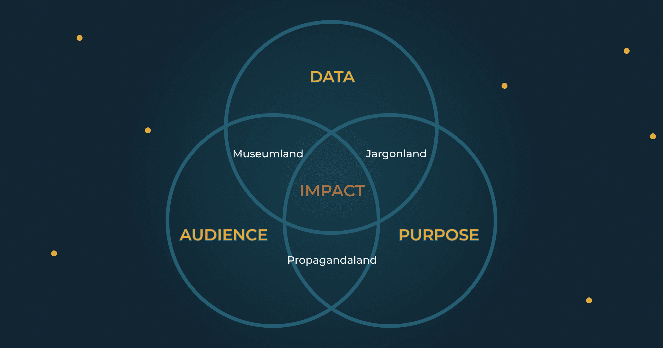
The Map
Every effective visualization lives in a small space where three things overlap. I'd show you something more sophisticated, but the Venn diagram earns its place here: simple enough to remember, clear enough to use, and humble enough that no one will accuse you of showing off.
Data is what your research actually shows: signal and noise, findings and uncertainty.
Audience is the specific person who needs to act. Not "stakeholders." Someone with a title and a decision to make.
Purpose is the decision you're trying to inform. The thing that should be different after someone uses your work.
Miss one, and you've hit a dead end. Most failed visualizations aren't completely lost. They're two out of three. Close enough to feel like you're doing it right. Far enough to fail anyway.
Propagandaland
You have the right audience and purpose. The data doesn't support the weight you're putting on it.
You believe in what you're doing. The cause is good, the audience is right, the decision matters. It's just that the evidence is... softer than you'd like. So you firm it up.
This isn't always a conscious lie. More often, it's a slow, well-intentioned slide. You're so convinced of your mission that you start building a case instead of seeking truth. The visualization stops being a window and becomes a closing argument.
You bury uncertainty in footnotes. You choose comparison groups that flatter your thesis. You're not asking "what does this data show?" You're asking "how do I visualize this conclusion?"
The difference sounds subtle. It isn't.
Propagandaland feels righteous. Your cause is good; why wouldn't you present it favorably? But you're accumulating reputational debt. It comes due the day a skeptic pulls your methodology apart in public, and your allies discover they've been defending claims your data can't support.
The tell: a small knot in your stomach when someone asks how you handled the uncertainty.
Museumland
You have rigorous data shown to capable people. Nobody knows what to do with it.
Here, you've built a beautiful exhibit that people visit once. The dashboard with 47 metrics. The interactive tool where every variable is filterable because you couldn't decide what mattered.
The instinct, when you're unsure what's important, is to show everything and let the audience decide. This feels generous. Democratic, even. It's actually abandonment. You've handed them a flashlight and shoved them into a warehouse. Technically, everything they need is in there somewhere. They're still going to leave.
The world is full of visualizations built to impress other data people. Yours gets a thoughtful "hmm, interesting," a mention in a newsletter, and then oblivion. You built a museum piece when you needed a decision tool.
The tell: when someone asks "what should I do with this?", you find yourself saying "well, it depends on what you're interested in."
Jargonland
You have important data meant to drive a real decision. You've translated it for the wrong audience.
This was our fate with the hockey scouts. Here's an uncomfortable truth: a significant portion of your audience is constitutionally incapable of understanding a scatter plot. They will nod as you explain it, but they're being polite. Inside, they feel stupid, and they will resent you for it. Your sophistication has become a wall. They smile, they nod, and they never use your work again.
The curse of Jargonland is that it feels like everyone else's fault. If they'd just try to understand. If they had basic statistical literacy. If they weren't so attached to their intuitions.
But they're not going to change. And your research will die waiting for them to.
The tell: you've explained the same concept three ways in one meeting, and concluded that they're immune to logic and reason.
The Diagnostic
Which dead end are you in?
Propagandaland (missing: data integrity)
You knew the conclusion before you finished the analysis
You buried uncertainty in footnotes instead of showing it
You selected comparison groups that flatter your narrative
Your internal review focused on "messaging" more than "accuracy"
Museumland (missing: purpose)
You can't name the ONE decision this tool should inform
You included metrics because they were available, not because they're decision-relevant
Your success metric is "engagement" rather than "action taken"
The tool works equally well for five different audiences (which means it works for none)
Jargonland (missing: audience fit)
People nod when you explain it, then never reference it again
Your internal testers find it intuitive (they already understand the domain)
You've optimized for precision at the expense of clarity
You secretly believe the problem is your audience's sophistication, not your communication
The Center (all three present)
You can name the one person who needs to act differently
You can state the decision your visualization should inform
Your data supports the claim at the confidence level you're implying
The Escape
The way out isn't a better chart. It's a better question.
With the hockey scouts, we eventually realized the problem wasn't just jargon. We were solving the wrong problem entirely.
Our models had enough uncertainty that we couldn't reliably distinguish the 5th-ranked prospect from the 3rd. But that wasn't the real issue. The scouts were burning first and second round picks on players so weak they didn't crack our top 100. We didn't need precise rankings. We needed to prevent catastrophic decisions.
So we stopped explaining regression. We asked a different question: what's the minimum a scout needs to avoid a disaster pick?
The answer was rules of thumb they could verify themselves.
"No player who scored fewer than 40 goals in that league has ever played in the NHL."
"Only one goalie without a 90th-percentile save percentage has ever become a starter."
We built league- and position-specific thresholds. They were memorable. They were verifiable. And if I'm honest, they were a little embarrassing. Years of training in sophisticated methods, and our breakthrough was "count to forty."
But the scouts could check these rules against players they already knew. Because they could verify them, they trusted them.
Soon we heard our language coming back in draft meetings: "He's over the point-per-game threshold for defensemen from that league." The rules had become their rules.
The next year, the team had its best draft in 33 years.
The Pattern
The escape from dead ends starts with the same question: What decision, and for whom?
Work backward from there. What's the minimum evidence that person needs to act with confidence? Not the maximum you can provide. Not everything you know. The minimum they need.
For the scouts, the minimum was: "don't waste a premium pick on someone who's almost certainly not NHL material." Everything else (the regression models, the confidence intervals, the R²) was noise.
When you know the decision and the decider, the right visualization becomes obvious. You stop building museums. You stop speaking jargon. You stop stretching data to fit a narrative you've already written.
You find your way to the center of the diagram.
Your Move
Before your next project, try this: name the one person who needs to act differently because of your work. Not "policymakers." Not "the community." One person, with a title and a decision to make.
Picture them in their version of that room. The one that smells like hockey tape, or floor wax, or government-issued coffee. Imagine their face as you explain your findings.
What would make their eyes light up?
That's your center. Start there.
Your research took years to produce. Finding the center might take a conversation.
Two out of three feels close. It isn't enough.
More From the Blog